Website personalization course
Learn how to increase conversion rates with a proven website personalization strategy.
Learn how to increase conversion rates with a proven website personalization strategy.
Hey, it’s Csaba here, and welcome to OptiMonk’s website personalization course!
Running an online business has never been easy, and it’s getting even harder every day. Shoppers’ expectations are going through the roof, and they expect the same flawless and relevant experience they find on their favorite sites, like Amazon, for example, on every ecommerce website they visit.
Amazon makes you feel as if they know exactly what products you need because they’re always showing you relevant recommendations and content based on your behavior. They even relate to their customers on a personal level, calling users by their first names.
And this is what website personalization is about: creating the most relevant user journey for each and every visitor as an individual. It’s about understanding that no two visitors are alike, and optimizing their onsite journey based on their unique behavior and interests.
Ten years ago, creating a personalized onsite experience was an unachievable goal for small and medium-sized businesses. It used to present a technological challenge that the average company didn’t have the resources to solve.
But today, any marketer has access to the cutting-edge technologies and solutions that were only available to the very top brands ten years ago. All you need is the time and willingness to learn about the biggest opportunities for web personalization and then to set up some personalized messages to tap into them.
Personalization doesn’t have to take a lot of time, nor do you need the help of a huge IT department or a graphic design team. With today’s top personalization software and platforms, you can easily launch your first few messages within a couple of minutes.
And what will you get out of it? First and foremost, you’ll significantly increase the efficiency and ROI of all your marketing activities. That means better conversion rates, lower acquisition costs and increased sales.
Second, you’ll be able to generate more subscribers and collect much more first-party data, which reduces your reliance on Facebook and Google as your main acquisition channels.
And finally, a more personalized experience will lead to happier visitors, building true connections and long-term relationships.
In this course, I’ll cover all the topics necessary to kick off your web personalization journey.
First, you’ll learn how personalization works from both a technological and customer perspective.
Second, I’ll teach you how to uncover the biggest issues in your current customer journey—which are also the most interesting opportunities for personalization—as well as how you can create visitor segments based on these insights.
Third, we’ll go over the simple process of creating personalized messages for your visitors that feel truly relevant, and therefore have the best chance of grabbing visitors’ attention and interest.
And finally, you’ll learn about measurement, testing, and the process of continuous optimization. This vital skill will equip you to get the most out of web personalization in the long run.
This course will empower you to create a customer journey that’s unique, remarkable, and meaningful on a personal level. It will help you boost sales, grow your lists, and win customers for life, all at the same time. Sounds too good to be true? Just wait till the end and decide for yourself!
Now let’s jump into the first lesson, which is about the different types of website personalization. I’ll see you there!
Hey, it’s Csaba, and welcome to our first module, which is about the basics of website personalization. In this first lesson, we’re going to talk about the different types of website personalization.
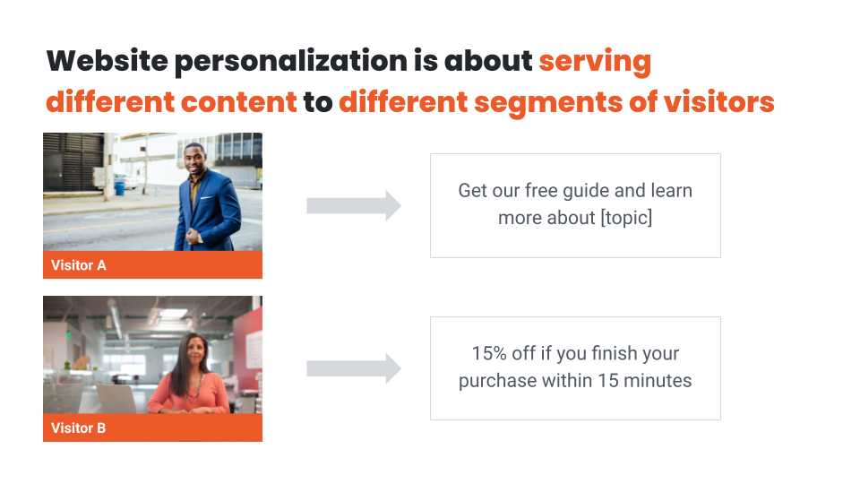
Your site visitors are diverse, and each one of them has their own unique background, desires, interests, and motivations. So, showing the exact same content to all of them probably isn’t an effective way to engage them, right?
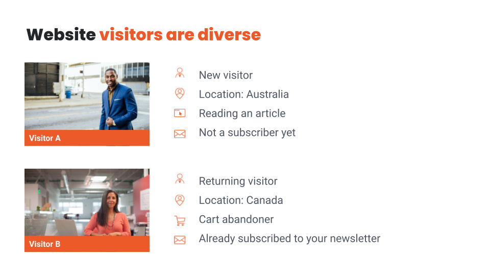
Website personalization is about serving different content to different segments of visitors. Often these different messages are called experiences, since visitors who belong to different segments will have different onsite experiences.
There are two main types of website personalization: Embedded content and Overlays.
Embedded content is about changing the native, base content of the website, like changing a headline to appeal to the interests of some percentage of visitors or by embedding an extra offer for some other segment. It’s the least intrusive way of web personalization, since visitors will just naturally browse the site and digest the personalized content as they go, without necessarily even noticing that they are seeing personalized content.
Overlays, on the other hand, lay over the background content and conceal some part of it. The most common types of overlays are popups and sticky bars. Hence they are usually more intrusive (since they appear automatically), but they are also easier to notice, and thus they have much better conversion rates than embedded forms.
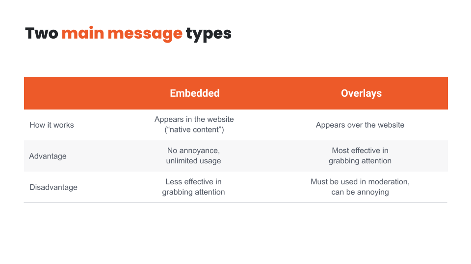
We’ll talk about finding the right message type for your personalized messages later, but, for now, let’s conclude that both embedded content and overlays have their use in a well-managed personalized website. Getting the most out of your personalization efforts will require using both types of messages.
In the next lesson, we’ll talk about what kind of data you need for website personalization. I’ll see you there!
Hey, it’s Csaba, and welcome back! In this lesson, we’re going to discuss what kind of data you need for website personalization. Let’s get right into it!
When you think of website personalization, you probably think immediately of Amazon. Every time you go on there, you see your personalized homepage that’s been compiled by the latest and greatest AI, based on data like what you’ve browsed or purchased previously.
So, wouldn’t it be great to have a homepage that looks just like Amazon’s?
The first thing you’ll need is the right customer data for personalization. As you can probably guess, Amazon has a huge advantage in this aspect compared to your business. The good news is that every online business has access to plenty of data that can be used for website personalization.
In fact, access to data is the most important advantage that an online store has over a brick-and-mortar store.
Online shoppers leave a trail of useful information as they shop, and marketers are only just recognizing how valuable this data is.
While Amazon has access to user data from millions of shoppers and billions of orders, every online store has access to demographic, location-based, behavioral, and lots of other types of data.
Some examples of different data types any ecommerce retailer can use are location, campaign parameters, browsing history, purchase history, or satisfaction.
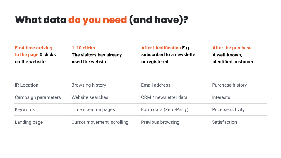
As you can see, you can tailor your messages to even first-time and completely anonymous visitors (before they make even a single click on your website).
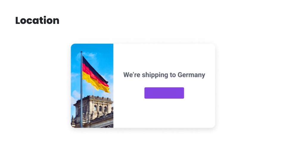
For example, if you can see that a shopper is from Germany based on their IP address, you can show a message informing them that you ship to Germany.
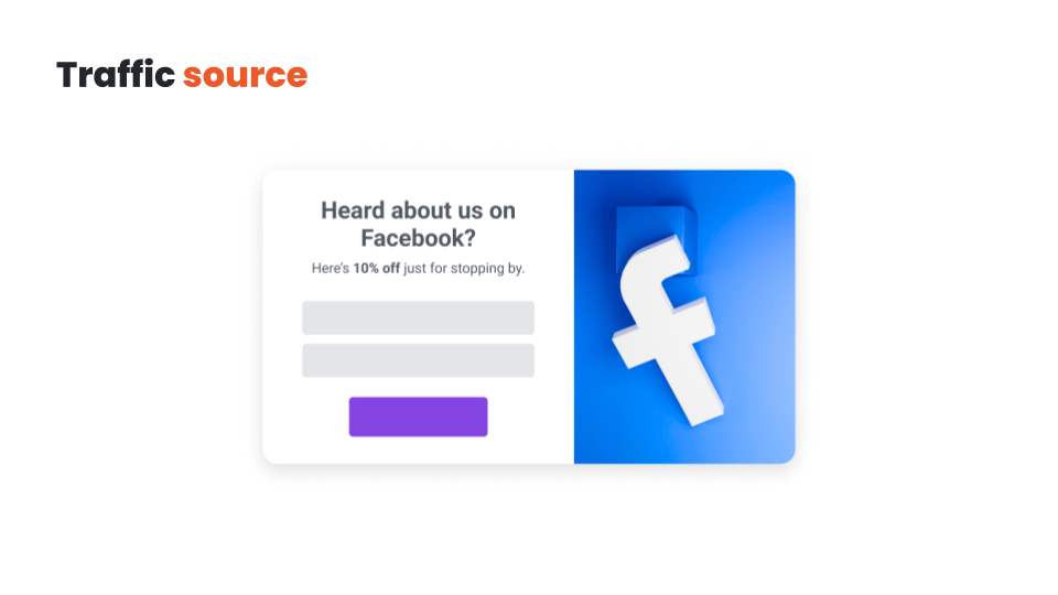
Or, if a visitor was referred from a Facebook campaign targeted at 25-35-year-olds, you can assume that this visitor fits within that demographic.
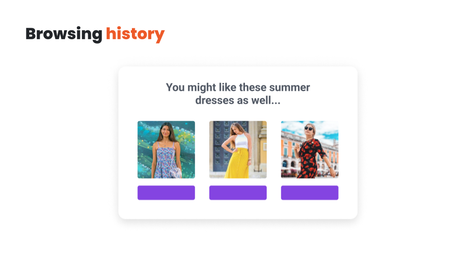
After a visitor starts browsing your site, you have even more data. Their browsing history tells more about a visitor’s interests than any other data. If the visitor clicks on a summer dress, then they are probably interested in summer dresses and you should show them further summer dresses.
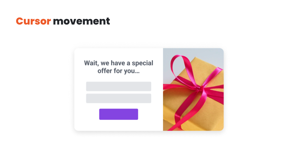
Another popular data-collection method is monitoring a visitor’s cursor movement and scrolling. Looks like the visitor is just about to leave the site without buying or subscribing? Just show them a nice exit-intent popup with a personalized message in the right millisecond and stop them in their tracks.
Amazon-like personalization and product recommendations are often based on previous purchase history. Here, you might think the more data you have the better. But in fact, recency is much more important than quantity when it comes to customer data. Data about dozens of orders over several months can be more misleading than today’s single browsing history.
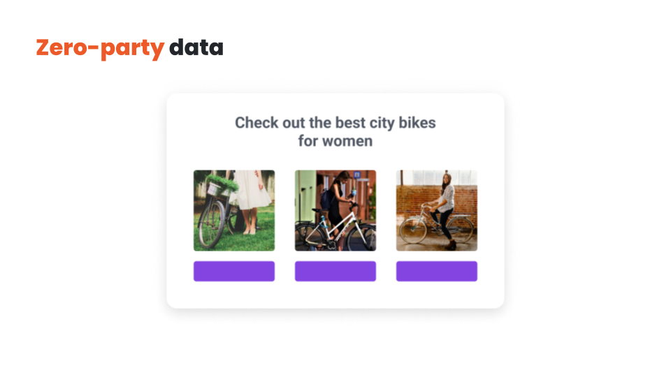
The best data is often collected directly from visitors answering questions. This type of data is called zero-party data. For instance, if a visitor completes a “How to select a bike” quiz and they select the answers “from a city” and “woman”, then you can communicate content that is related to these characteristics and be confident that the visitor will find it relevant.
These are just a few examples of the data that you probably have access to and can use for personalization. Depending on your industry, web store, or even the marketing solutions you use, there might be a lot of other interesting data points available to use for personalization.
In the next lesson, we’re going to talk about the technical challenges of website personalization, and the potential solutions to overcome them. I’ll see you there!
Hey, it’s Csaba and welcome back! In the previous lesson, we talked about the number one challenge of website personalization: data collection. Now, we’re going to discuss the technical challenges of putting that data to use!
The next challenge of website personalization is actually serving personalized content to your visitors. And here’s where the biggest differences exist between the two main types of website personalization, embedded content and overlays.
Using embedded content to personalize your native, base content requires loading the extra, personalized content AFTER your main base content has loaded. This is usually done through a Javascript code, either replacing existing content or inserting a new one. Both take time and can have a negative side effect, which is called a flicker.
If your website flickers, a visitor will see your webpage loading once and then quickly changing content to display something new. So, it’s basically a kind of flash or flicker that occurs as your content changes.
This flicker can be managed in multiple ways:
The good news is that the first two options – using a top-notch personalization tool like OptiMonk and being careful about the size of the personalized content – will usually result in basically unnoticeable flickers, and thus, a perfect experience from a customer perspective.
Another popular way of managing speed issues is using overlays to deliver personalized messages whenever possible.
Popups and other overlays don’t have to appear at the same time as the native, base content. In fact, delaying overlays by a couple of seconds actually makes them more efficient, and results in better conversion rates.
But of course, the use of overlays needs to be limited, otherwise, the visitor will feel flooded with “annoying popups”.
In conclusion, picking an overlay format for the most important message and serving the rest of your personalized messages as embedded content is usually the best combination.
In the next lesson, we’ll talk about the website personalization process and how to get started.
Hey, it’s Csaba, and welcome back! In this lesson, we’re going to talk about the website personalization process.
As you could see in the previous lessons, even the smallest online businesses have a large array of options for website personalization. It may explain why, despite all the proven benefits of personalization, many marketers lose interest when they realize what the personalization process actually entails.
They decide—consciously or unconsciously—to just ignore website personalization in order to focus on further optimizing their ads and sending even more campaign emails to their customers. But there’s only so much optimization potential in Facebook or Google ads.
On the other hand, the potential in website personalization is endless and can result in tremendous overall growth in your marketing results. And spending a couple of hours a month looking for new optimization opportunities and acting on them is the only cost. In fact, this could be the single most ROI-positive activity of an average online marketer.
The secret of successful website personalization is – just like with many other things – starting small.
Instead of trying to create hundreds of personalized messages for dozens of segments, just pick out your top three opportunities and create a handful of personalized messages for your most important segments. Then simply follow a disciplined optimization protocol, reflecting on and learning from your previous efforts on a monthly basis.
The process of website personalization can be summarized in 3 main steps:
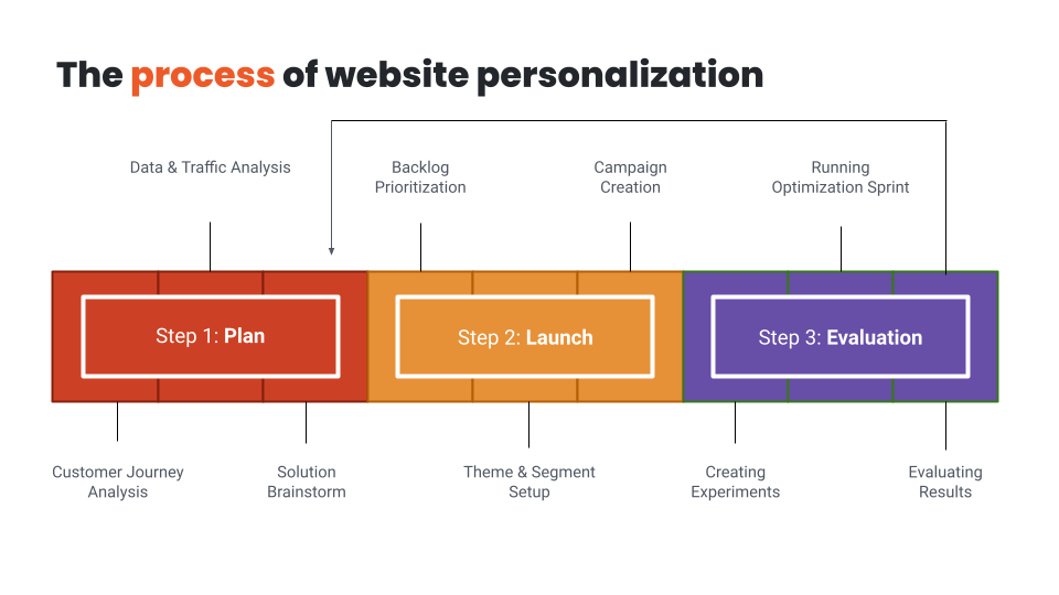
As you can see, the three steps form a circle, which means that website personalization is an ongoing process. The best way to look at is like continuous experimentation. There’s always room for improvement, and your patience and resources are the only barriers to experimentation.
So where should you start? How should you pick your first three personalized messages? In the next module, I’ll dig deep into Audience discovery, and show you the most popular ways to gather insights about the potential glitches and opportunities in your website’s user journey. See you there!
Hey, it’s Csaba, and welcome to the second module which is all about finding the right audiences to target. Step one is discovering the best website personalization opportunities which is what this lesson is about.
Building a personalized experience for your shoppers must start by clearly defining your goals: for whom do you want to create a better, more personalized experience?
A group of visitors that will be targeted by a personalized message is called a visitor segment.
The first step in website personalization is uncovering groups of website visitors, who share two important characteristics:
There are lots of ways to uncover potential issues in your visitor’s experience. Let’s discuss the top ones!
The first approach is data-based: have a look at your Google Analytics account. It has several reports that can help you understand the problems that visitors face while browsing your website.
You should look for visitor segments that have significantly lower conversion rates compared to other segments. These low-performing visitor groups could be segmented by source, country, content, or landing pages visited, just to name a few.
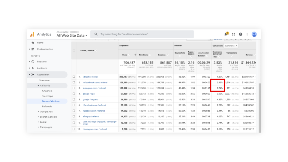
Here you can see that a surprisingly large number of visitors arrive at this page from Instagram. But they convert at a much lower rate than the visitors arriving from Facebook. This might imply that visitors from Instagram are having a poorer experience than visitors from Facebook, and creating a personalized message for this particular segment could considerably improve their experience. And as a result, the conversion rate of this segment should increase.
Of course, numbers don’t tell the whole story. But they do leave clues as to what the major customer journey challenges are. If there’s a page with an exceptionally high bounce rate or where the conversion rate for an ad is very low, there are usually problems with the customer experience.
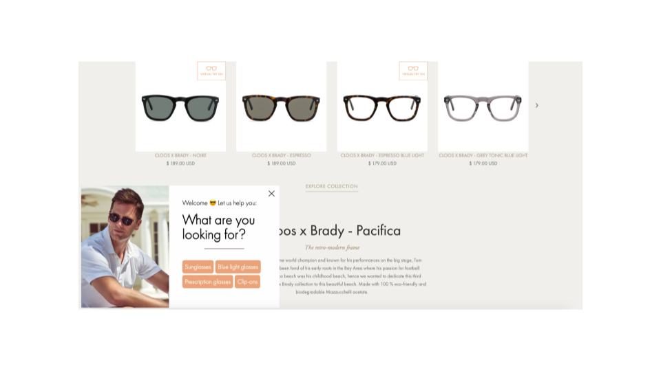
So the next best method to really understand these user issues is to ask your visitor directly. Use a personalized message, like a sidemessage or popup, to welcome your Instagram visitors and ask them what they are looking for, or what they are missing. This is the surest way to get quality feedback directly from the customers you are trying to serve!
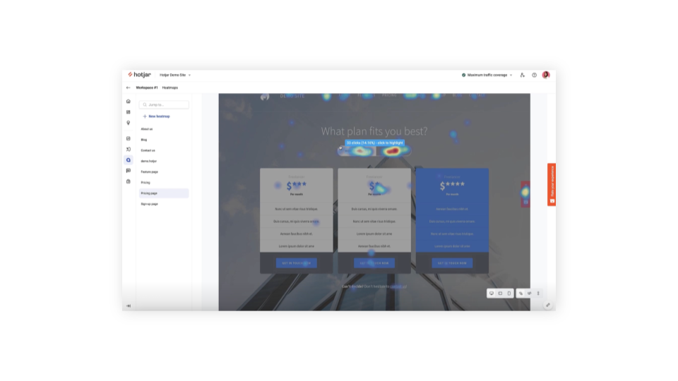
A less revealing, but somewhat easier method, is to use heatmap and mouse tracking software, like Hotjar, to examine the customer experience from the shopper’s perspective. They allow you to record every cursor movement of the users and you can watch these sessions later in the form of a video.
Often one of the greatest sources of customer insights is your customer support department. Customer support channels hear about issues directly from your customers, and pain points that customers frequently complain about are usually great opportunities for personalization.
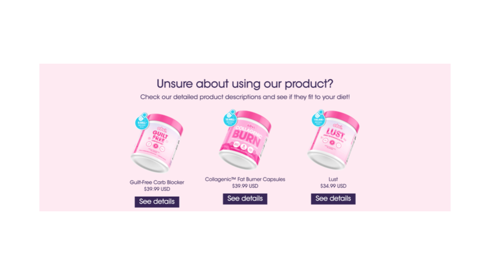
A lot of visitors from one of your campaigns might ask the same question about one of your products. For example, if you’re promoting a supplement to people with diabetes on Facebook, they might be unsure whether it is suitable for their specific diet. In this case, you could create a personalized embedded message for this particular segment.
And finally, customer interviews are one of the most accurate — but also most expensive — ways to uncover great insights about your site’s performance. In customer interviews, you’ll watch a customer live (or on Zoom) as you ask them to navigate your website, perform specific actions and give you honest feedback.
Once you’ve investigated and found a number of opportunities for improvement, you need to prioritize them.
It’s not a good idea to start trying to fix every problem at once and create dozens of different campaigns. Instead, select the top three most important problems and create an optimization plan for each of those.
Alright, that’s it for this lesson. Next time, I’m going to share some visitor segmentation best practices. I’ll see you there!
Hey, welcome back! In this lesson, we’re going to discuss how to segment your visitors. Let’s get right into it!
Picking the right visitor segments is usually no easy task, since there are nearly unlimited ways to segment your visitors. Now I’ll try to share a couple of best practices that the best online businesses employ when creating separate audiences for personalized messages.
There are three main types of segmentation:
The first is Demographics-based segmentation, which is about grouping your visitors based on factors like location, age, or income.
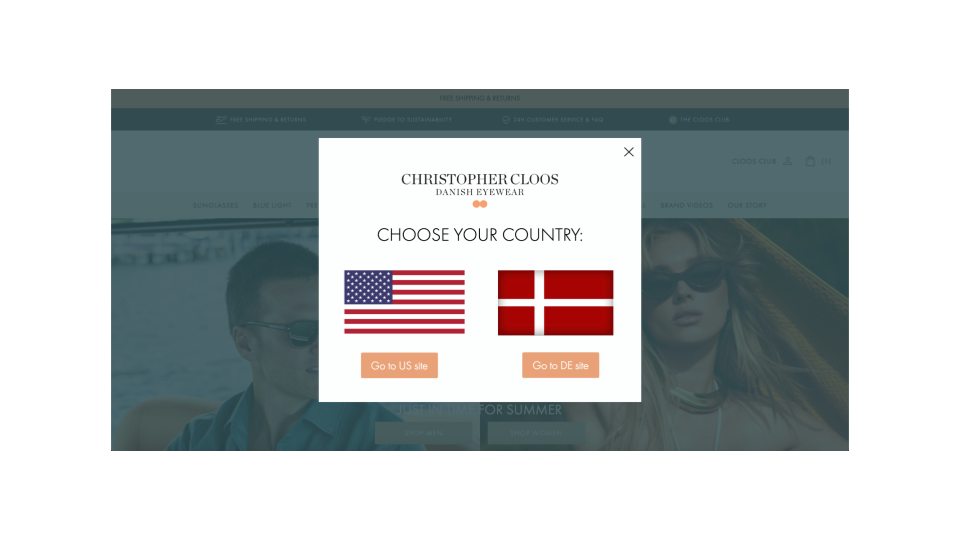
For most online businesses the easiest, always-available factor is location. Based on a visitor’s IP address, you can very much predict the country and sometimes even the city they are browsing from. If you run an international business, creating segments based on location and providing a personalized experience for each major country and language is a surefire way to boost user experience.
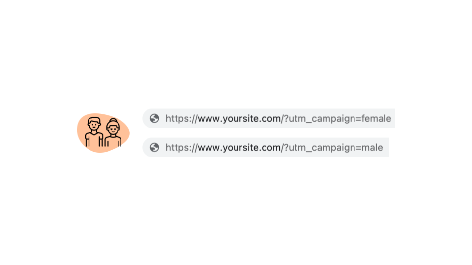
Another way to conduct demographic-based segmentation is to use the same segmentation you use for your Facebook ads. On Facebook, you can target people based on a lot of demographic properties, and with the right UTM tagging, you can carry over this information to your website to provide a personalized experience.
The second main type is Psychographic-based segmentation, which is about segmenting customers based on their interests, attitudes, values, and other lifestyle factors.
This is usually easiest to do based on their onsite behavior: if someone is browsing iPhones on your website, then you can assume that they’re interested in Apple products. Therefore, you should recommend that visitor other Apple products rather than Samsung products.
Using your Facebook ads or landing pages for interest-based segmentation is a good idea: if someone clicked on an ad or landed on a page about weight loss, then you can safely assume that he or she is interested in weight loss, and personalize your messages based on this information.
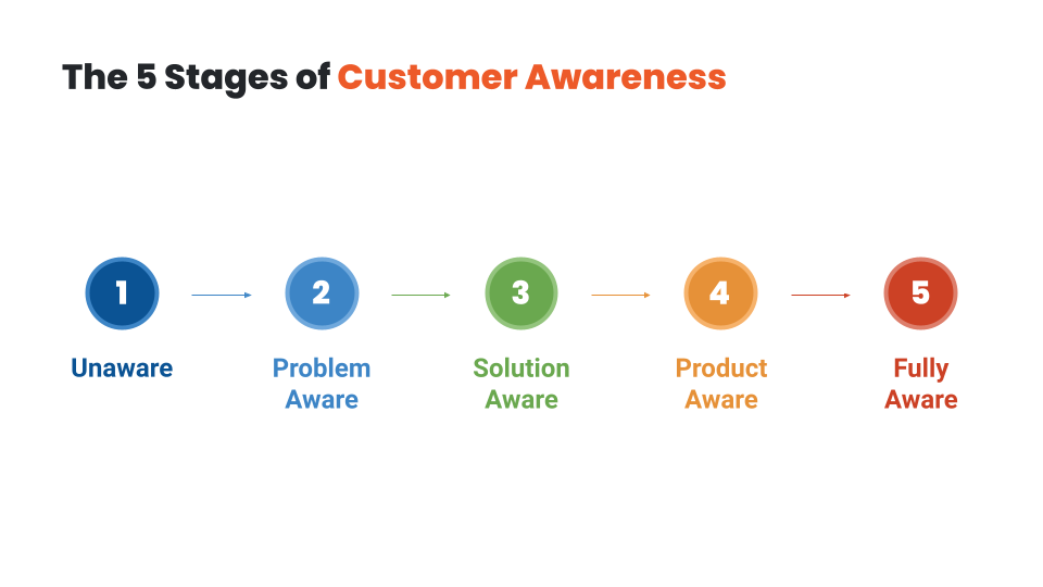
The third type is Intent-based segmentation, where you basically segment the visitors based on where they are in their own customer journey.
It’s sometimes called awareness-based segmentation, since all visitors go through five awareness stages. People with no-awareness or problem-awareness usually have low buying intent and need different types of messages than visitors who are already product- or even fully aware and have high buying intent.
How can you segment visitors based on their awareness level or buying intent? Again, their behavior is the best indicator. You should differentiate between visitors who arrive on your site after searching for low-intent keywords like “how to lose weight” and those who are searching for high-intent keywords like “best weight loss products” or “Hydroxycut prices”. You can also track their content consumption on your website. Are they reading one of your problem-based articles, or actively browsing your products?
Now you might have some ideas on how to segment your audience. In the next lesson, we’ll discuss the timing of your messages: when is the best moment to trigger your personalized messages to these segments? I’ll see you there!
Hey, it’s Csaba, and welcome back! In this lesson, we’re going to discuss how to choose the right moment to display your messages.
If you find a well-defined audience that has a shared problem, and then craft a great message for this particular segment, you’re already halfway towards success. But with website personalization, you have the added luxury of choosing not only the audience and the message, but also the timing of your message. When you get all three right, you’ll have the best results!
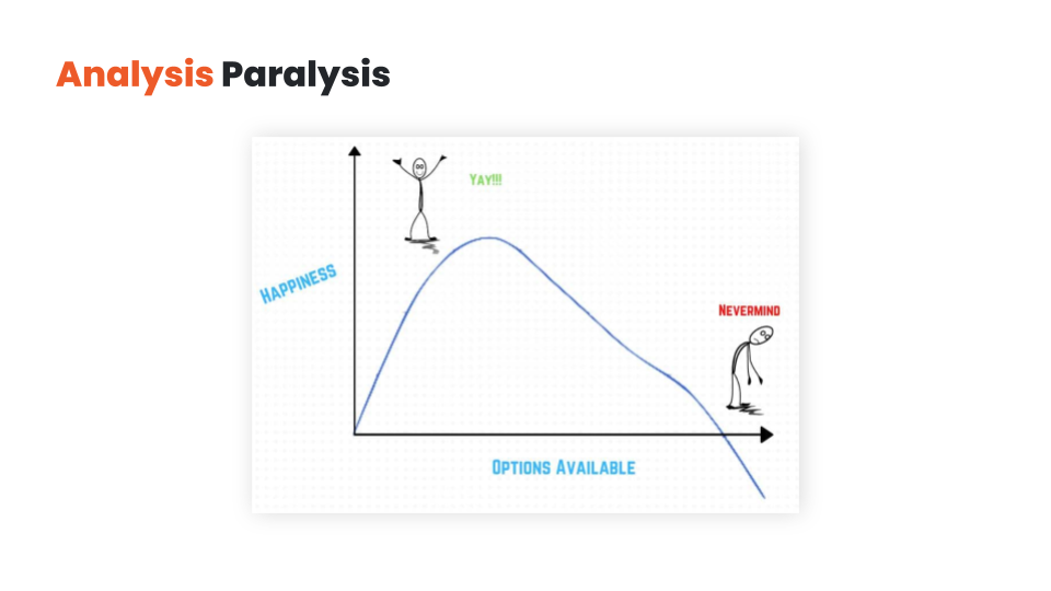
Visitors have limited attention that they can devote to your messages, and you can easily overwhelm them by displaying a lot of different messages. Even if they are the greatest, most personalized messages, they will ignore all or most of them. At best, they’ll just pick up on the one that commands the most attention. Worst case scenario, they’ll just leave. This psychological effect of too much choice is called analysis paralysis, and it’s an outcome that marketers dread.
Having self-restraint and prioritizing your messaging is a good start. But you also have the option of delaying some of your messages instead of displaying all of them at the same time.
This approach is called layering. Overlays give you the opportunity to trigger some of your messages later (based on time spent on page, or user activity like exit-intent or like a 50% scroll down).
With layering, you can get visitors to focus on your most important messages first, and then use a secondary message as a backup plan if your primary messages aren’t working.
Let’s say your visitor is searching for “the best weight loss pills for men”.
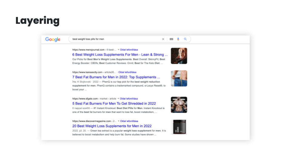
This implies that the visitor is solution-aware and in need of some education about the best products, so your primary content could be a blog article comparing the best weight loss pills for men.
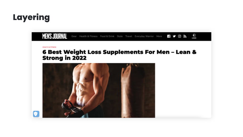
But if they’ve scrolled through 80% of the article, you can assume that they’re becoming increasingly product aware, so it might be a good idea to test for buying intent by showing them a special offer. You could also use some time-limitation (like “this discount is only available for the next 15 minutes”) to increase fear-of-missing-out (FOMO).
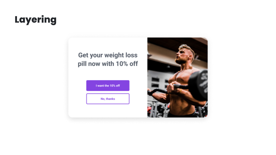
And just in case they’re still not responding, you can still have an exit popup in your back pocket. You can offer your best content in exchange for their email address, and this allows you to build and nurture a relationship with them.
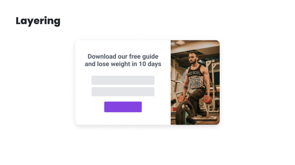
While having all these offers embedded into the main content could work, having them layered like this will significantly improve your chances at getting a conversion.
In the next lesson, I’m going to share the best ecommerce personalization use cases. I’ll see you there!
Hey, it’s Csaba, and welcome back! In this lesson, I’m going to share the top ecommerce personalization use cases. Let’s get started!
Understanding what your customers really want and figuring out how you can help them is the best way to create personalized experiences that are truly meaningful.
But luckily, there are a couple of strategies that most successful ecommerce brands use, each of which can provide you with inspiration for your own personalization strategy.
Let’s have a look at these examples starting at the beginning of the user journey:
First, let’s talk about the landing page.
My number one advice is to change the copy & headline of the landing page based on demographics or interest. As discussed, these factors can most easily be pulled from the ad you’re using to draw traffic to the landing page. For example, if you’re selling a portable blender, like Blendjet, you might have several value propositions.
You’ll most likely experiment with creating ads based on each of these value propositions. If someone clicks through the ad promoting portability, then this is what you should promote on your landing page.
On the other hand, if your ad promotes the Self-cleaning feature, then this could be the main value proposition on the landing page.
If your product can solve more than just one problem, and you run advertising to different customer segments based on their problems, it can be a good idea to personalize the landing page — including the headlines and the product recommendations — based on the segment’s needs and serve different headlines for people who, for instance, want weight loss and for people who want better sleep.
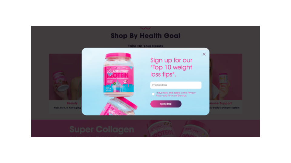
Alright, after the landing page, the next step in the user journey is usually list building, which is generally accomplished through welcome popups.
Of course, you shouldn’t show a list-building welcome popup to those who are already subscribed. With this segment, you can and should move forward to the other personalization use cases.
But for those visitors who aren’t subscribed, you can personalize this welcome popup based on the country they’re visiting from, serving different popups to people from the United Kingdom.
Another option is to use their interest to personalize the popup – in a very similar fashion to the examples seen with landing pages – and serve different value propositions for people who, for instance, want weight loss.
You can also differentiate based on traffic source, and try giving a special welcome to Facebook/Instagram users or to people visiting from a partner’s website or Facebook/Instagram profile. Each of these personalizations can easily boost subscription rates by up to 100%!
And don’t forget about returning visitors: welcoming them back with the products they were browsing on previous visits will not only help them continue where they have left off, but will leave a really nice impression.
The next strategy is to personalize special offers on your website so that they don’t look generic. This will increase their efficiency.
For example, giving your special offer a deadline and inserting a countdown — not just a fake one, but a real one — and providing dynamic discount codes can as much as double the efficiency of an offer.
Or just simply inserting the name of the current month so the offer FEELS more special will increase conversion rates by up to 10%.
Getting the most out of seasonal offers like running a teaser campaign before Black Friday and then communicating it again on the day is also a great way to boost sales.
You can also differentiate your offers based on intent and source: you can decide not to offer discounts to visitors clicking through from Google Shopping or other price comparison sites—since these users already have high buying intent and they’ve already seen your prices. Or if people clicked through from specific campaigns, you should remind them, but only them, of the offers that those ad campaigns communicated.
But the real magic happens when you create real targeted offers to specific segments, like rewarding your VIP customers or reactivating churned and at-risk customers.
And of course, you can also use the interest- or demographics-based personalization: if people want better sleep, well, give them better sleep even in your offers as we’ve seen the examples with landing pages and welcome popups.
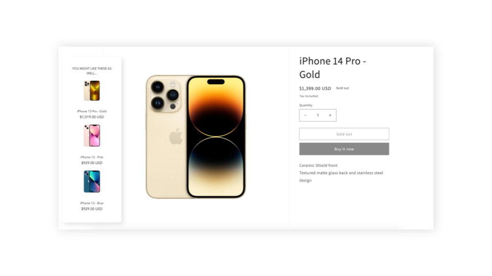
Personalization can also be very effectively used for upselling and cross-selling.
Recommending products to users based on their behavior is a basic best practice.
But you can also get more creative, like upselling specific products based on cart value or cart content, promoting the most popular products to people who are in an earlier awareness stage, or making it clear how much extra spending is required to qualify for free shipping. Ideally, these messages should be tailored for each country.
Yet another popular approach is offering free items if the customer’s cart has reached a certain amount/milestone.
Next up is cart abandonment. Decreasing cart abandonment is always a big focus of ecommerce marketers.
Reminding users of their discount codes, while reminding them of the associated deadline is a really good starting point.
Emphasizing limited stocks either in embedded format or in an exit popup can also significantly decrease cart abandonment.
For those visitors who haven’t yet subscribed and are eligible for a discount, you can offer this discount when they try to leave your site empty-handed.
And of course, all these offers can be adjusted based on the value and/or the content of the cart.
In cases where you don’t want to offer discounts, you can experiment with promoting your most popular products, getting a second chance to raise the visitor’s interest.
And here’s the last step in the user journey. Sending your feedback collection messages at just the right moment will ensure you aren’t annoying your customers.
As mentioned, getting feedback about what visitors are missing on product pages or on shipping pages can be a very effective way to get quality user feedback.
Alternatively, you can choose to measure the overall satisfaction with your website followed by extra questions to get more in-depth information based on their answers. You can also use this same technique to get testimonials from satisfied customers!
And finally, the most efficient way to get real attribution data is to ask your customers where they heard about you. It’s especially important if you’re doing a lot of brand building and/or social marketing, where most of the attribution is undetectable through Google Analytics.
As you can see, there are many use cases for personalized messages during different stages of the user journey. In the next module, I’ll show you how to create personalized messages that your visitors will love—and that generate amazing conversion rates. I’ll see you there!
Hey, it’s Csaba, and welcome to the third module. Over the next few lessons, we’ll go over how to create and set up winning personalized messages. In this first lesson, we’ll look at all the different message formats you can choose from. Let’s get right into it!
You can deliver personalized messages on your website in many ways. Each message format has its own advantages and disadvantages.
At a high level, we can rank the different message formats based on how assertively they capture the visitor’s attention. Overlays usually rank higher on this scale than embedded messages, which means that they are a more effective way to get people’s attention and thus they have higher conversion rates.
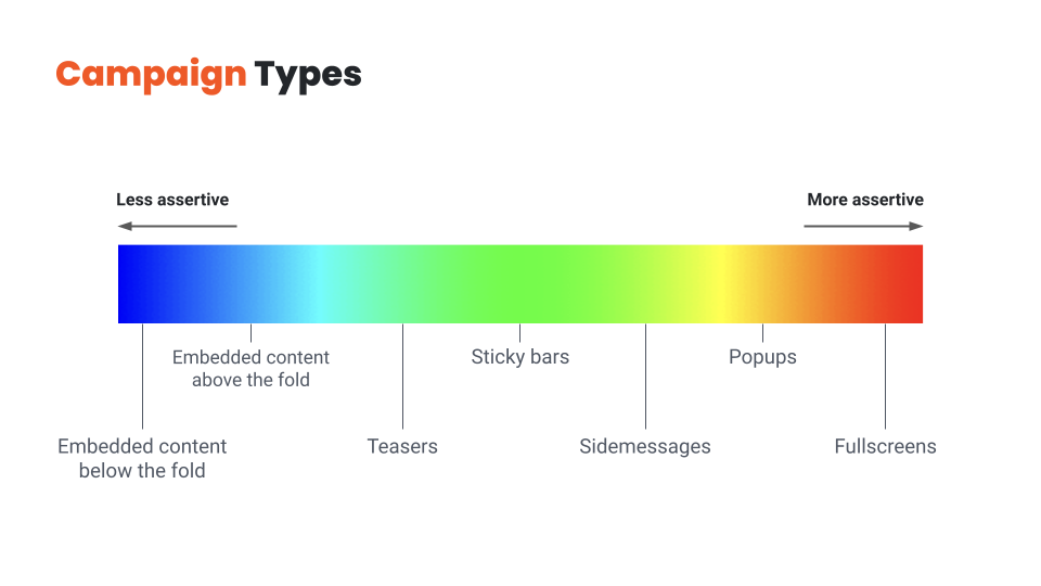
So why shouldn’t you use overlays to deliver all your messages? You guessed it: because they’re also more intrusive, and overdoing them will result in a frustrating user experience.
Finding the right balance between embedded messages and overlays is key.
You should choose overlays for your most important messages and use personalized embedded messages for the rest. If you use only embedded messages, you’ll leave a lot of money on the table, but using only overlays will quickly become annoying for your visitors.
So let’s quickly review these message types from least assertive to most assertive:
Now that we’ve covered all the potential message types, let’s see how we can get the most out of them!
Hey, it’s Csaba, and welcome back! In this lesson, we’re going to discuss how to find the right value proposition for each visitor segment!
There are lots of ways to improve the efficiency of your messaging, but there’s one aspect that stands above all: the customer has to care about the message.
If the main essence of your message—whether it’s an offer or an explanation of your value proposition—doesn’t resonate with the visitor, any tactic you try to increase conversions will be like putting lipstick on a pig.
That’s why understanding your customers and figuring out what their pain points are, and how you could better help them, matters so much.
Given that basic understanding, here are a couple of rules of thumb to help you create messages that really resonate with the user:
Rule no. 1 is to talk about the visitor’s problem.
Everyone has a problem. There may be no better way to get someone’s attention, than starting with a recognition of their problem and pushing their “buttons”. You might have an incredibly compelling offer for a visitor, like offering to win a diamond necklace worth $2,000…. But if the visitor is a guy named Ben, who is looking for a wedding ring for his fiancee, he’s not likely to be interested in winning a necklace. On the other hand, if he gets an offer like “Get 10% off on our exclusive wedding rings”, he’s almost certainly going to sign up to an email list in order to get that discount. It’s also a good idea to focus on the benefits of your offer instead of the offer itself. Say someone is browsing your website to get better sleep, mentioning that problem in the headline instead of leading with “free ebook” will most likely result in better conversion rates.
Rule no. 2. is to give a compelling offer.
If you want your visitors to take some action, you need to give them a compelling enough reason to do so. Even if you’re just trying to get people to sign up for your newsletter, that small action comes with a “cost” to the visitor: they are paying with their time and privacy. So what constitutes a good reason to sign up? For ecommerce stores, the surest way to get someone to sign up for email or SMS is to “bribe” them with a discount. While it’s often the easiest solution from a marketer’s perspective, the offer doesn’t necessarily have to be a discount or even monetary: based on the user’s awareness stage and interest, free content or educational resources can be even more powerful. While a 15% discount doesn’t really need much explanation, other offers can be a little bit more complex. In these cases, you’ll need to be more creative in how you explain the value of your offer in a short and concise manner.
Rule no. 3 is to make the visitor feel special.
Messaging that makes the user feel more special will improve both your results and customer experience. If you’re using a targeted message to a specific visitor segment—which you should—the easiest way to make someone feel special is to make it clear that you’ve created this message just for people like them. One way to do this is by highlighting the name of the segment in your message itself, just like BoomByCindyJospeph did. You can also use the simple tactic of using the visitor’s first name or referring to their country in your welcome messages. A really special offer, only valid for a small group of visitors, can also make a visitor feel like a brand is relating to them as a person. It’s always worth remembering that your visitors are pretty smart: you can claim that your offer is “special”, but if every detail of it shouts that it’s a generic offer—like using a simple discount code like 10OFF—then your visitors will feel like you’re trying to fool them rather than feeling special.
This takes us to rule no. 4, which is to increase the fear of missing out (FOMO).
While trying to rush someone who isn’t ready to make a purchase is generally not a good idea, giving a reason for product- or fully-aware users to buy now rather than later is one of the most efficient psychological tools in an online marketer’s arsenal. The most basic method is making all your offers “seasonal” rather than running generic 10% off all year. You can have Halloween offers, then Black Friday/Cyber Monday offers, then Christmas offers, then Valentine’s sale, and so on. Fortunately, there’s some special holiday or occasion every week, so you never have to run out of seasonal opportunities. Also, you can use simple methods like countdowns and reminders to keep the visitor aware that your offer is limited and so are your products.
And finally, it always helps to put some fun and/or surprise into your messaging.
It can be as simple as a witty headline like TheOodie’s. Or Zendesk’s. Or you can even take it a step further and use self-deprecating humor in your copy. Another way to add an element of mystery to your messaging is as simple as offering a “Mystery discount”. Finally, you can use a suite of gamified messages like Lucky Wheels, scratch cards, or Pick-a-gift campaigns.
Hopefully, you’ve come up with a few new ideas for your value proposition. In the next lesson, we’ll discuss how to refine these ideas into a high-converting message. I’ll see you there!
Hey, it’s Csaba, and welcome back! In this lesson, we’re going to talk about crafting a high-converting message.
Let’s assume you’ve found the right message for the right audience – that’s already half the battle! But there are many small details that can mean the difference between an average and an awesome conversion rate.
Again the specifics vary between industries and specific brands, but there are a few important rules of thumb to remember:
Rule no. 1 is that less is more.
Your customers shouldn’t have to struggle to grasp your message right away, rather, they should immediately understand the value of your offer. When it comes to writing a copy for your website, simplicity is king. You definitely don’t want your visitors to get confused about what the words in your headline or popup mean. Keeping your copy as short as possible is the primary way of ensuring comprehensibility. Your visitors will understand your message best if it only contains the words you need to get your point across. It’s also important to have as few call-to-actions as possible, each of which should be clear and consistent with the messages you’re sending. If you want to craft an effective CTA, a simple “Sign Me Up” or “Send My Discount Now” usually does the trick.
Rule no. 2. is to be human.
It’s always worth remembering that your visitors are humans, and humans are emotional. And to engage with them, the best thing you can do is to get over your fear of the “F-word” – which is “feel” ;). Depending on your goals, you can trigger the right emotion with your messages. Like if you’re trying to encourage them to make a charitable donation, you could use words and images that connect your message to your audience’s hearts. You can also be more human and likable by speaking the language of your target audience. If you’re selling to a young audience, feel free to use slang, but you won’t want to use it for the 65+ demographic. It is also true for images, which brings us to the topic of design.
Rule no. 3. is to use a clear design that puts focus on your main value proposition.
Never use images without a clear reason that goes beyond just making your messages “look better”. Use images to support the message itself rather than to just grab attention. Choose images that reinforce — or at least don’t contradict — what your copy is saying. Mismatched text and images are confusing because your visitors won’t know which message to focus on. Another strategy is to insert visual elements like arrows that point toward the call-to-action button. An arrow encouraging visitors to “Click Here” will always increase the salience of your CTA button. But be careful, it also increases the noise, so use it only sparingly.
Rule no. 4 is to be consistent with your design.
While it might be easy to pick a popup template that somewhat resembles your website’s design, having it match exactly in terms of fonts, colors, and overall style will make both the results and the customer experience much better. It’s even more important if you are using multiple personalized messages on your website. Having a chaotic mix of random embedded and overlay messages will make the visitor feel confused and disoriented.
Once you’ve cut down your copy to just include the essential parts, and made sure that all your copy and images are consistent with your website and also with each other, you have a powerful message in your hands.
That’s the end of module three. In the last module, we’ll talk about evaluating the effectiveness of your personalization efforts, revenue attribution, and A/B testing. I’ll see you there!
Hey, it’s Csaba, and welcome to the final module of OptiMonk’s website personalization course! Over the next lessons, we’ll talk about measuring the performance of your messages and optimizing them to achieve even better results. First, let’s dive into the question of how to evaluate whether your personalization efforts are effective. Let’s get right into it!
For any kind of marketing activity you undertake, there should be a measurable way of deciding whether or not the time and money you put into it were worth it. Measuring the results of personalization efforts is equally as important as measuring the ROI of a Facebook ad campaign.
So how do you go about it?
First of all, you need to decide what numbers you are going to use to measure success. These will be your KPIs or Key Performance Indicators.
You can choose to use any of the leading indicators, like click-throughs or signups (which are based on actions someone takes immediately upon seeing a personalized message), or lagging indicators like revenue or customer lifetime value (which can take some time to show up).
Depending on the nature of your personalization efforts, it can make sense to track your results using each of the KPIs just mentioned. But, you should also be aware that lagging indicators like revenue can be very misleading in some circumstances. For example, if you measure the performance of a signup form based on the extra revenue it generates, you can easily be led astray. Why? Because your store’s bottom line will be influenced by a great many different factors besides your personalized messages.
Once you’ve decided what to measure, you need to find the right tools to measure your KPIs.
For leading indicators like click-throughs and signups, the personalization platform you use will often provide a decent reporting and analytics system.
For more complex lagging indicators, you’ll probably need additional analytics solutions, such as Google Analytics.
But the problem here is that Google Analytics and similar tools are only able to measure anonymous visitor activity over the course of one session. That means you won’t be able to connect the dots between different, longer-term personalization campaigns.
That’s why having a personalization platform like OptiMonk makes sense. It keeps a complete overview of each customer’s journey from the very beginning to the end, which means you can attribute outcomes like revenue to personalized campaigns over longer periods. Thus, you’re able to measure the efficiency of even your most complex personalization efforts.
Given that you’re tracking the right KPIs with the right tools, how can you actually measure the extra revenue that your personalization efforts have generated? By running experiments, which are often called A/B tests.
When you A/B test a personalized message, you compare what actions two different groups of visitors take: the ones who are having a personalized experience, which is often called a test group, versus a group of visitors who only ever see a generic, non-personalized, version of your website, which is usually called the control group.
In the next lesson I’ll introduce you to the world of A/B testing, and teach you how to run successful experiments. I’ll see you in the next lesson!
Hey, it’s Csaba, and welcome back! In this lesson, we’re going to dive into A/B testing.
As discussed in the previous video, there’s no single perfect way to measure the effeciency of your personalization efforts. Nonetheless, A/B testing has proven to be the most time-tested way to scientifically and continuously improve your results.
At a high level, A/B testing—which is also known as split testing—is about splitting your visitors into two or more groups, showing different content to each group, and then measuring which group had more conversions and ended up reaching your chosen goal.
In the personalization world, you’ll usually have an assumption or idea for personalization that you want to test. It’s usually called a hypothesis.
Then, you go ahead and create your personalized message. In order to see if it works, you’ll split the segment you’re targeting in two: showing your new personalized content to one half (which we call the test group) and the previous version to the other half (which is often called the control group).
After you collect enough data about the performance of these two groups (which is usually called statistical significance), you can evaluate the results and decide whether your hypothesis was true or false.
If it was true, your personalized message will result in more conversions or revenue and you can be confident to run this new message variant to 100% of your target audience. If it was false and you’re not making any extra conversions or money, then you can just cancel it, and let the show continue as it was before you tried out your groundbreaking idea.
Running A/B tests is the surest way to victory. Why? Because you have a super-limited downside, but an unlimited upside.
If your hypothesis turns out to be false, then you can just simply stop the experiment. The only loss will be (at most) a couple of conversions among the test group who saw the new message during this short period of time. But if your personalization idea really does improve your conversion rate, then you can run it endlessly and let it create extra value for all eternity.
A/B testing is a great method to fine-tune and optimize your existing messages for the best possible results. You can just easily create new variants and test new offers, copy, and CTAs.
But A/B testing is also a great tool to make decisions about the legitimacy of your new ideas: just create a new A/B test, display this new message to only one-half of your audience, and simply compare the results.
This wraps up OptiMonk’s website personalization course. Everything you’ve learned in this course will help you to get started with website personalization and improve your conversion rates. Thank you for joining me and be sure to like, share, and subscribe for more actionable videos and courses.
I’ll see you in the next course!
You finished the course, and now you’re wondering what’s next? How to get started?
We get it, it can be intimidating. That’s why we created a Website Personalization Worksheet that gives you everything you need to get started with website personalization. Born from our experience with hundreds of successful ecommerce stores, it’s the most valuable website personalization resource you’ll find online.
How to use the worksheet?
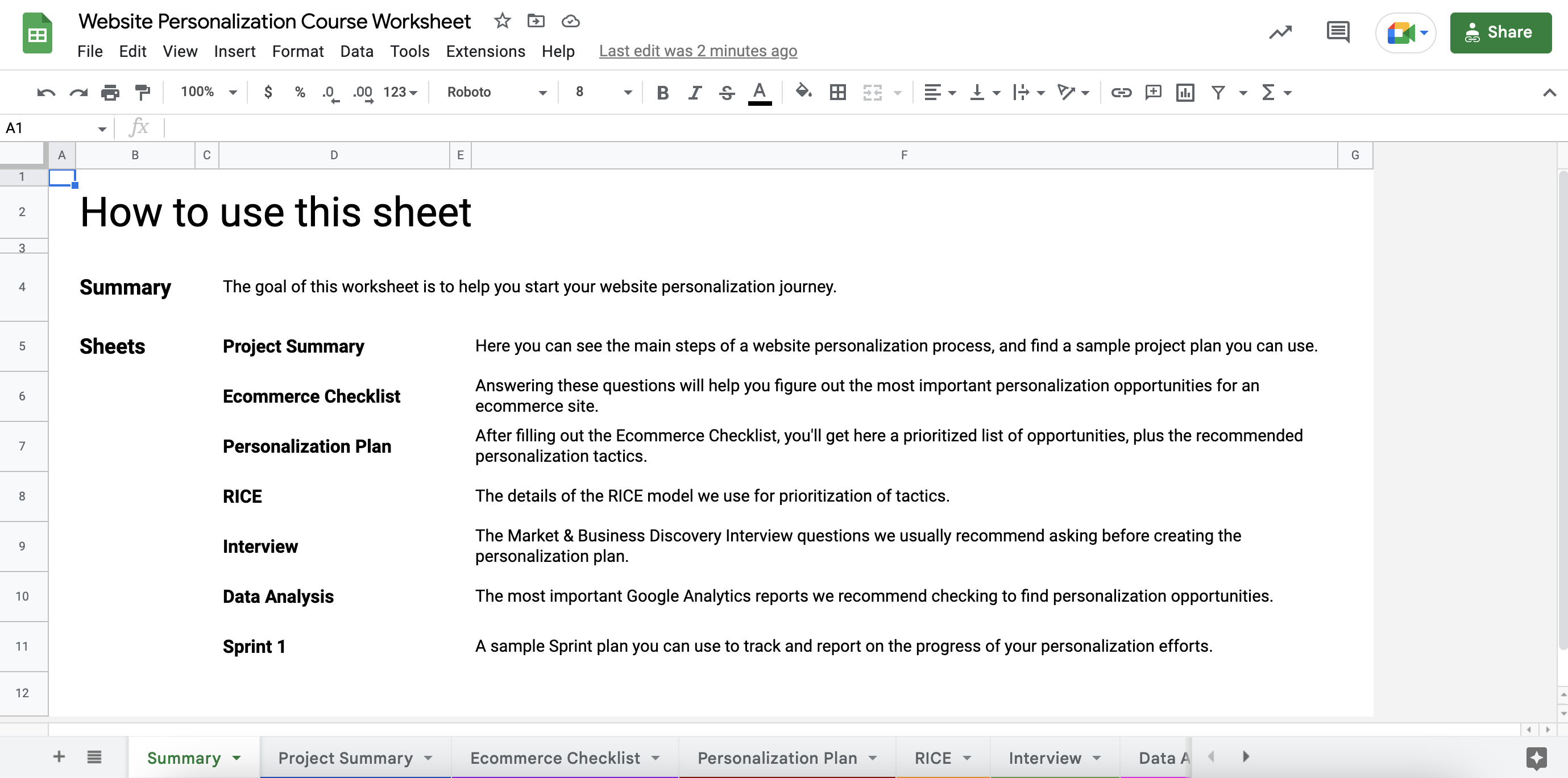
STEP 2: Go to the Ecommerce Checklist sheet and answer all the questions by adding a checkmark to the “Yes” or “No” columns.
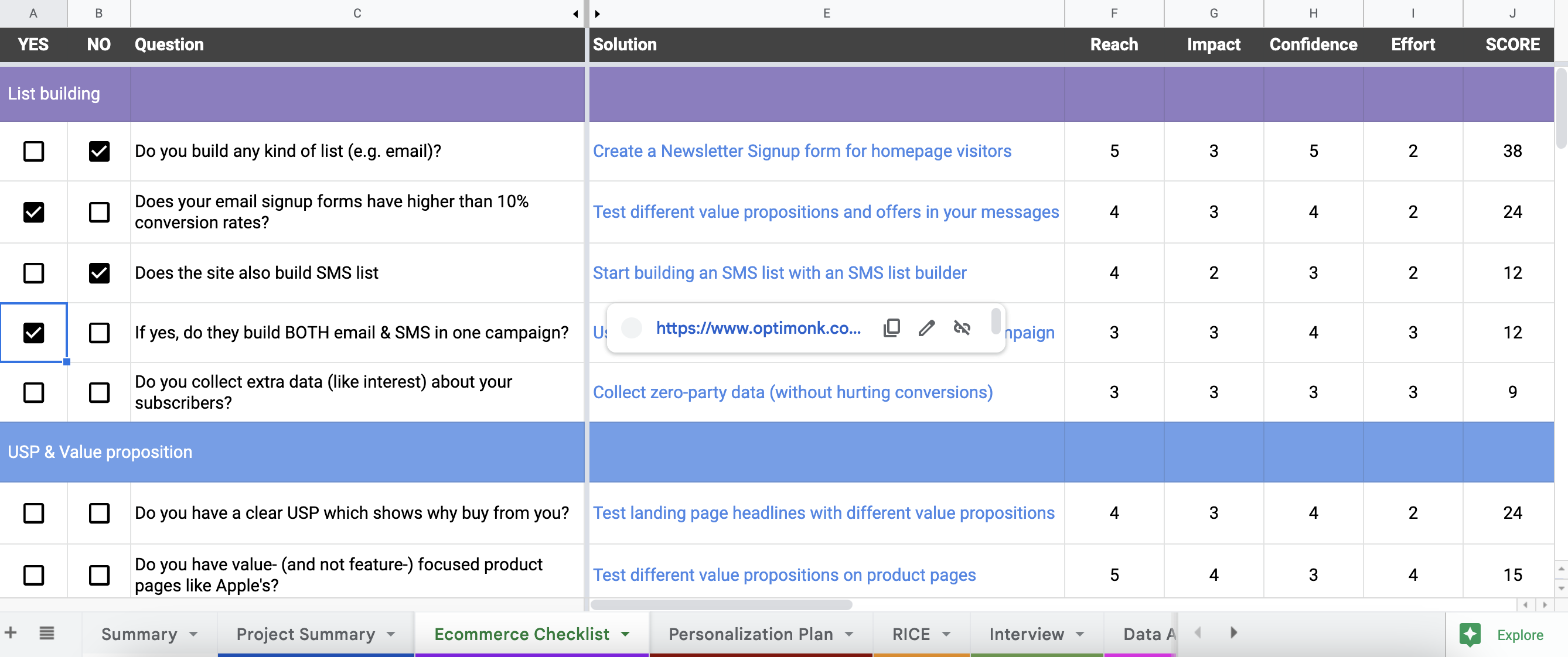
This will help you to uncover all the top personalization opportunities on your website.
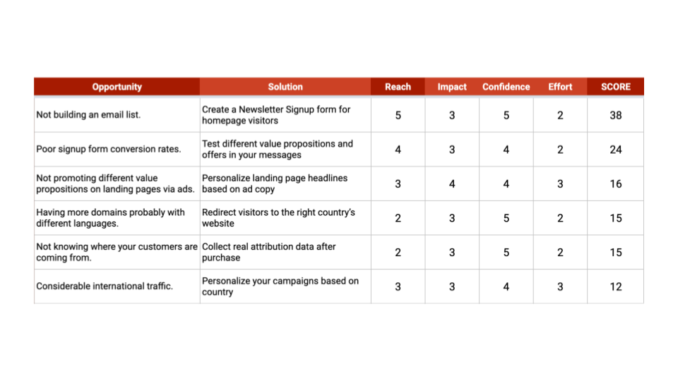
STEP 3: Go to the Personalization Plan sheet. Based on your answers, here you’ll see an automatically ranked solution plan (using the RICE scoring method) with a recommended tactic for each opportunity.
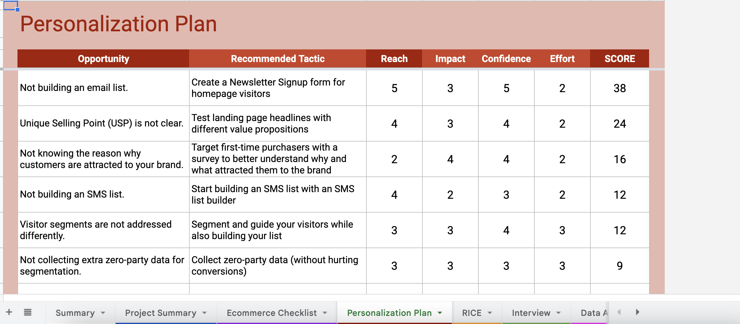
By hovering your cursor over the tactics, you’ll also see a link that gives you detailed guides on how to set up each tactic on your website.

From these links, you’ll be either redirected to a use case landing page full of ready-to-use templates (for basic tactics that are easy-to-setup), or you’ll be redirected to a step-by-step guide on how to set up the tactics (for more advanced tactics).
Besides this personalized plan, the worksheet also includes several useful tools, like a GANTT Chart, Sample Sprint Plan, Discovery Interview questions, and other tools to help you get started.
We hope the course and the worksheet together will help you to get started with web personalization and increase your conversion rates.
Good luck on your website personalization journey!
Get started now and turn traffic into sales!
Product updates: January Release 2025


